Peri-event analyses
As described in the User Guide, timewizard is quick and efficient at collecting peri-event data. Note that timewizard doesn’t acutally implement any kind of modeling for you – it just makes it easy to get the data.
import numpy as np
import timewizard.perievent as tw
import timewizard.util as twu
import matplotlib.pyplot as plt
from scipy.interpolate import interp1d
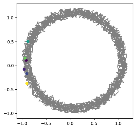
Let’s start with a simple example. Say you observed an animal’s position with a camera recording 30 Hz video, while capturing some other events in other data streams (say, vocalizations). You want to about the animal’s position across all of its vocalizations.
First, we make the data. This animal mostly ran in circles, with a bit of random noise added in:
np.random.seed(10)

fs = 30  # Hz
t = np.arange(0, 20*np.pi, 1/fs)
x = np.cos(t) + np.random.random(t.shape) * 0.2
y = np.sin(t) + np.random.random(t.shape) * 0.2
data = np.hstack([x.reshape(-1,1), y.reshape(-1,1)])
plt.plot(data[:,0], data[:,1], color='gray')
_ = plt.axis('square')

Vocalizations occured at points close to halfway around the circle, at some times that are not necessarily included in our 30 Hz sampling of position:
n_evts = 6
evt_times = np.random.choice(np.arange(np.pi, 20*np.pi, 2*np.pi) + (0.5 - np.random.random(10)), size=n_evts, replace=False)
np.isin(evt_times, t)
array([False, False, False, False, False, False])
If all you need to know is where the animal was when it vocalized, then you can just interpolate the data.
evt_postions = tw.map_values(t, data, evt_times, interpolate=True)
plt.plot(data[:,0], data[:,1], 'gray')
plt.scatter(evt_postions[:,0], evt_postions[:,1], c=evt_times, zorder=np.inf)
_ = plt.axis('square')
However, a harder problem is generating an array of the animal’s peri-event positions. For example, say you wanted to look at the animal’s position from 1 second before to 1 second after each vocalization. Timewizard provides an efficient solution for this:
peritimes, traces = tw.perievent_traces(t, data, evt_times, time_window=(-1,1), fs=fs)
traces.shape
(6, 60, 2)
Note that the resulting traces array is (n events) x (time) x (coordinate). Then we can easily plot the peri-event data:
for iEvt in range(traces.shape[0]):
    plt.plot(traces[iEvt, :, 0], traces[iEvt, :, 1])

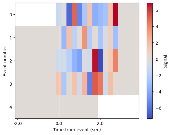
Dealing with boundaries
Here is a second example that shows off the edge-case handling when your event windows go over the bounds of your data.
# Make some fake signal
np.random.seed(2)
fs = 4
t = np.arange(0, 1000, 1 / fs)
window = (-2, 4)
event_times = np.array([0, 100, 400, 600])  # requested window for first event will be before bounds of data
signal = np.zeros_like(t, dtype='float')

# Add in some noise around the events, just for visualization purposes
for t0 in event_times:
    _slice = slice(int(t0 * fs), int(t0 * fs + (window[1] - 1) * fs))
    signal[_slice] += np.random.normal(0, 3, size=((window[1] - 1) * fs))
event_times = np.hstack([event_times, 998])  # purposely add an event that will extend after the bounds of the data
# Get aligned traces
ts, traces = tw.perievent_traces(t, signal, event_times, time_window=window, fs=fs)
# Plot the data
plt.imshow(traces, aspect='auto', interpolation='none', cmap='coolwarm')
plt.axvline((0 - window[0]) * fs, color="w", linewidth=1, zorder=np.inf)
twu.xticks_from_timestamps(ts, interval=2, ax=plt.gca())
plt.xlabel('Time from event (sec)')
plt.ylabel('Event number')
plt.colorbar(label='Signal')
<matplotlib.colorbar.Colorbar at 0x17988a310>